A plate directly under a kitchen lamp often looks flat or gains an unwanted colour cast. Beside a window, light is easier to observe and shape. Place an empty plate or similar object in the intended position first. This lets you check framing, reflections and shadows before food cools, collapses or changes its surface.
Light from the side rather than straight ahead
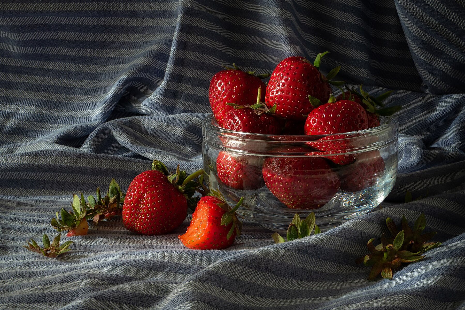
Side or slightly rear window light can reveal crusts, leaf edges and glossy sauces. Rotate the plate in small steps and watch where highlights appear. Direct sunlight can create hard patches; a thin pale curtain or another position beside the window often softens transitions. Avoid simultaneously using lamps with a strongly different colour.
A white card on the shadow side lifts dark areas. Move it closer until the desired texture appears. Too much fill can flatten the shape again. For a white bowl against a pale background, a dark card outside the frame may instead help define the edge.
Choose the angle for the food
A flat pizza or decorated plate can be organized clearly from above. A burger, tall dessert or filled glass often needs a lower view to reveal its layers. A universal 45-degree angle is therefore only a trial, not a requirement. Check which view shows the dish’s most important characteristic.
At an oblique angle, watch depth of field. A very wide aperture can sharpen the front edge while softening the actual filling. Focus on the decisive detail and stop down when necessary. A firm support allows longer exposures for stationary food without unnecessarily raising ISO.
Few props with clear roles
Cutlery, a napkin or ingredients should explain something about the dish or organize the frame. Remove objects that merely fill space. Check plate rims and glass for accidental fingerprints without making the food artificially perfect. Small crumbs may fit; one random large stain can quickly distract.
Make a closer and a wider frame before changing the setup. Check white balance and bright reflections in the original image. A white plate can provide a rough clue but is not automatically a colour-neutral reference. Preserve natural differences between warm bread, cool glass and green ingredients instead of unifying everything through excessive saturation.