A red sign against green foliage is easy to distinguish in colour. In black and white, both may acquire almost the same brightness and merge. A deliberate conversion therefore considers the original colours even though they disappear from the result. Shape, light and spatial separation must take over the work previously done by colour.
Test what remains without colour
Create a neutral black-and-white version first and view it small. Is the main subject still immediately recognizable? Do lines and brightness areas guide the eye coherently? If the photograph depends mainly on a particular colour combination, monochrome need not be the stronger version. Conversion is not an automatic repair for awkward white balance.
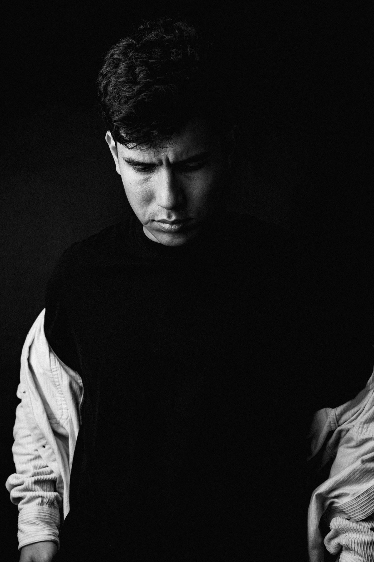
Look for repeating shapes, shadow edges and contrasting surfaces. A staircase may work through rhythm, a portrait through lighting. Decide which quality you want to emphasize. That gives the following tonal changes a purpose.
Translate colour ranges deliberately
A black-and-white mixer can render originally blue areas darker or yellow areas brighter, for example. Move one control gradually and watch every affected part of the photograph. Darkening the sky may also change blue clothing. A colour label does not select one particular object.
For the red sign against foliage, you might separate the two colour ranges until the lettering and shape become clear again. Extreme differences can create unnatural boundaries or amplify noise. Inspect fine transitions, especially hair, leaves and sky.
Large changes in red and orange ranges strongly affect skin. A very bright rendering may conceal marks but also flatten lips and facial shape. A very dark one may emphasize every small irregularity. Choose according to the portrait rather than a universal slider recipe.
Balance contrast at several scales
Adjust overall contrast until bright and dark regions work together. Then use modest local changes if the subject needs separation from its background. Not every surface requires pure black or white. A misty forest may appropriately retain a narrow, soft tonal range.
Check shadows for lost texture and highlights for empty patches. A dramatic screen appearance may lose important distinctions on matte paper. For an exhibition or gift, a small proof on the same paper is therefore useful.
A colourful subject with similar brightness values
A red door in a green wall may look clearly separated in colour. In a neutral grayscale conversion, door and wall can merge. Brighten the original red range slightly and darken green gently. Inspect not only the broad areas but also the handle, lettering and nearby plants.
If red and green recur elsewhere, the global mix changes those regions together. A red jacket in the foreground may suddenly become too bright. A local mask is then more useful than increasingly extreme mixing. Combining colour and position creates separation without reinterpreting unrelated objects.
The relationship between sky and clouds also needs checking. Darkening the blue range strongly can emphasize white clouds dramatically, but may amplify sky noise and fringes around trees. Compare a restrained second version at the planned print size. The stronger preview effect is not automatically the more readable photograph.
Keep the colour source
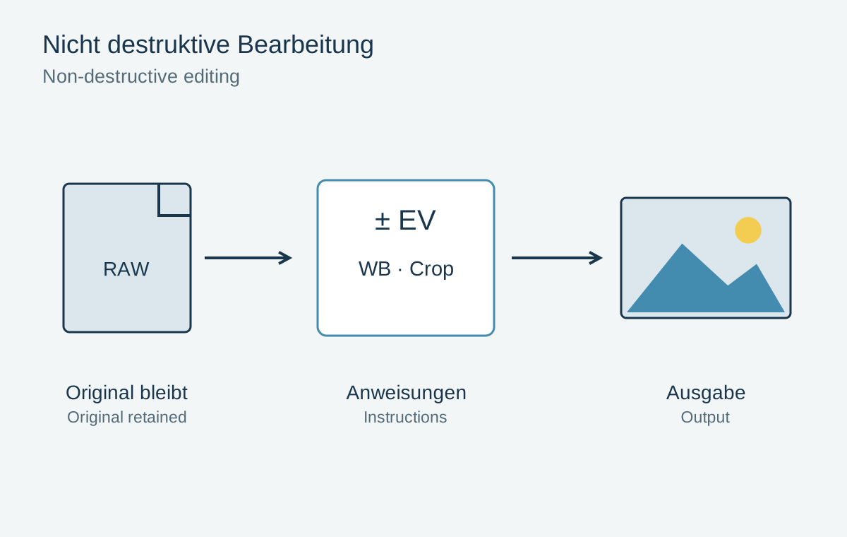
Keep the conversion editable. The original colour information allows another grey-tone interpretation or a colour output later. A finished file already reduced to grayscale no longer offers that choice.
Finally compare both versions without tool panels. Choose monochrome when it supports the intended observation. The possibility that a photograph might look older, more serious or more artistic is no substitute for a considered visual decision.