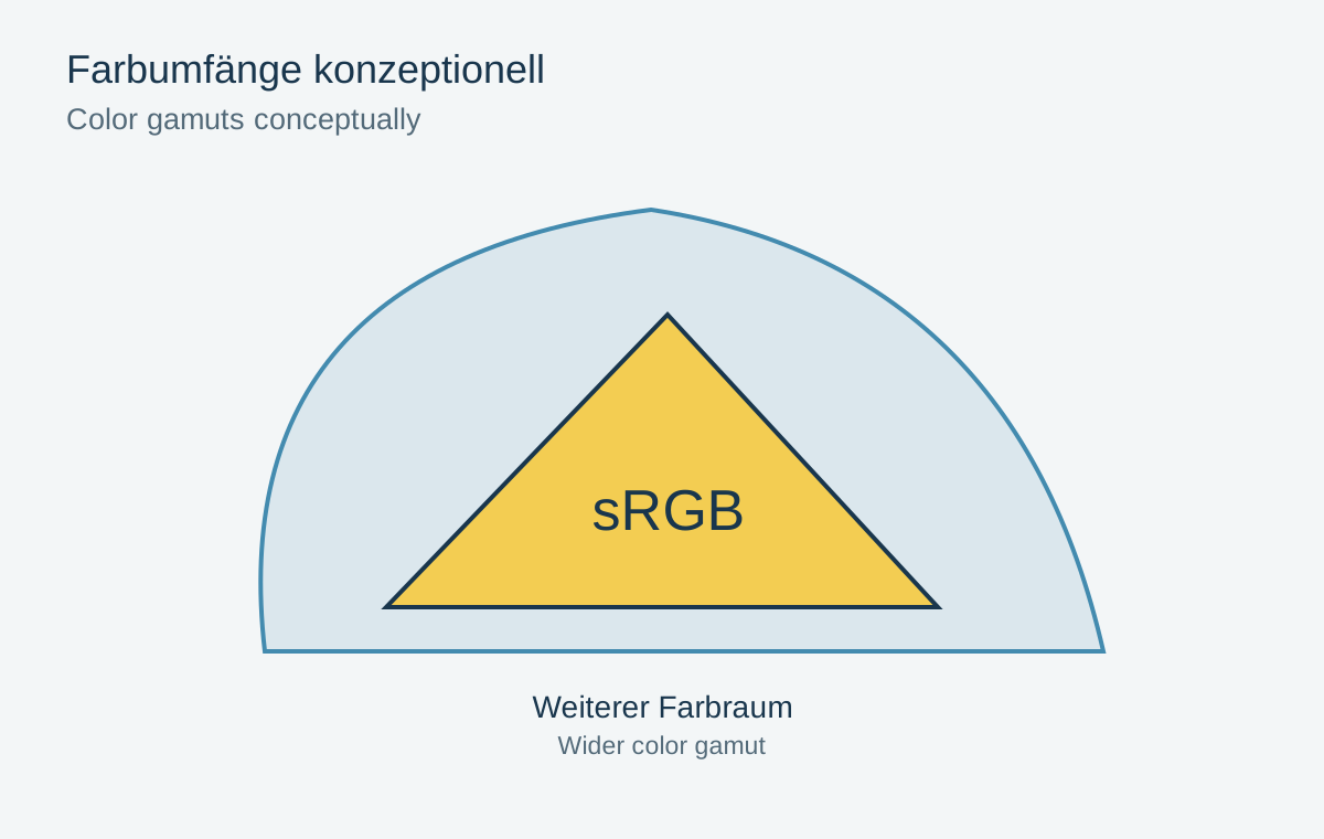
An RGB value does not unambiguously describe the same colour without a colour space. An embedded profile tells a colour-managed application how to interpret the numbers. sRGB, Adobe RGB and other working spaces differ in the colours they can represent. The useful choice depends on the source, editing workflow and intended destination.
Separate working space and delivery
A wide working space can preserve colours during editing that a later output cannot reproduce fully. This provides flexibility, not an obligation to distribute every file in that space. sRGB is often the compatible choice for general web delivery. A print service may specify something different.
Check those requirements before exporting. Assuming that bigger is always better can produce unexpectedly pale or exaggerated colours when the recipient ignores or misinterprets a profile. A photograph containing restrained colours also does not automatically gain a visible benefit from a wider space.
Assigning is not converting
Assigning a profile preserves the RGB numbers but gives them another meaning. The visible colours can consequently change substantially. This is useful when a file lacks a profile and you know its actual origin. It is not an arbitrary colour-improvement control.
Converting calculates new numbers for the destination space, aiming to preserve appearance where possible. Colours outside that destination must be adapted. When preparing a correctly profiled file for sRGB, conversion is normally intended, not simply attaching an sRGB label.
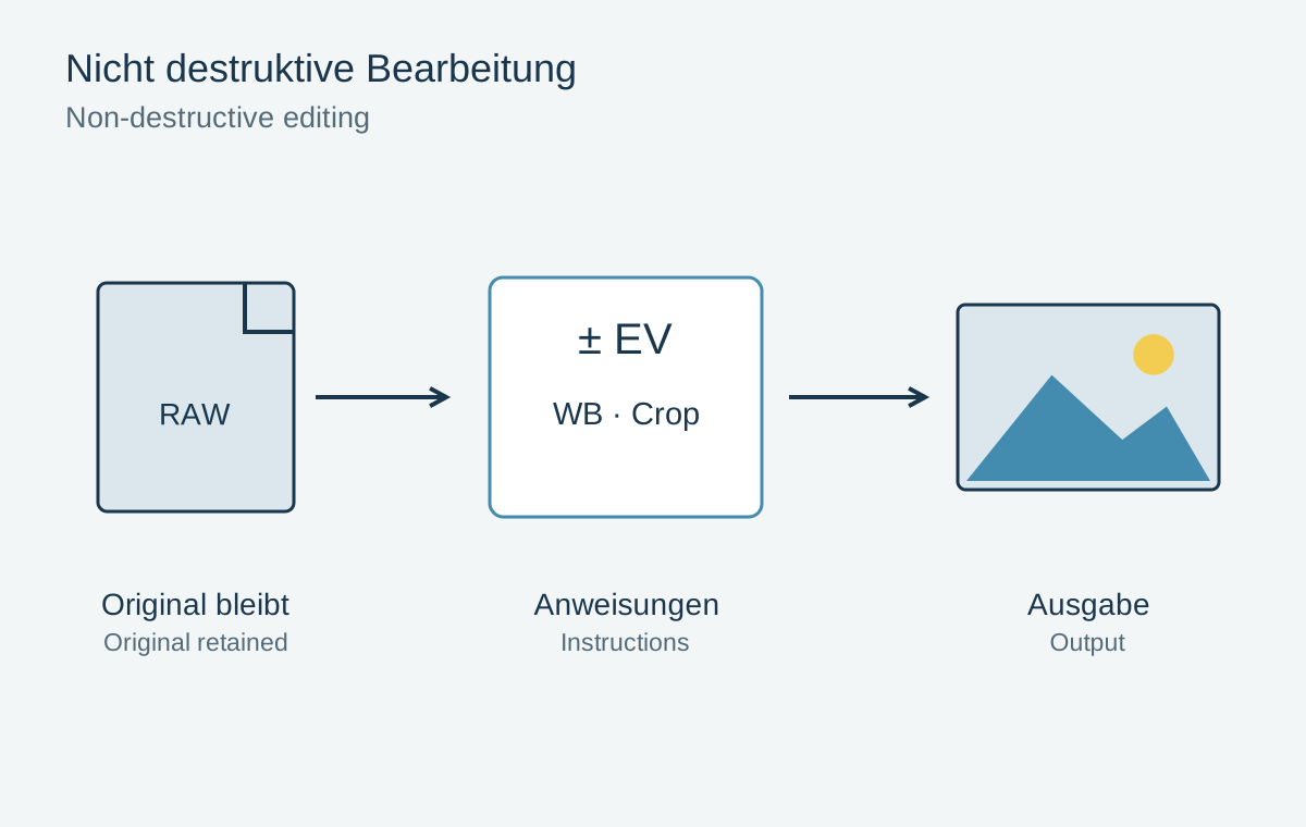
Preserve a master before making these changes. Converting back later cannot reliably separate colours that were already merged or clipped. The small web copy should therefore not become the only source for future prints.
Investigate an unfamiliar file
Suppose you receive an untagged JPEG and skin looks unusually orange in your application. First ask about the export process and original colour space. This is more reliable than assigning profiles one after another and declaring the most pleasant version correct. The numbers alone do not uniquely reveal their original meaning.
A correctly rendered reference file of the same photograph can help narrow the possibilities. Work on a copy and document the assumption. A screenshot is a limited reference because display rendering and screenshot storage may introduce further conversions. Without reliable provenance, the interpretation remains an informed estimate.
The situation differs when the source is known to contain Adobe RGB and a website requires sRGB. Open it using its existing profile, convert an output copy to sRGB and embed the destination profile. Compare the copy with the master in the same colour-managed application. If the overall appearance remains similar while a few intense colours change slightly, that may be a normal consequence of the smaller destination gamut.
Retain the profile through the workflow
Embed the appropriate profile when saving where the destination workflow supports it. Inspect the exported file in a colour-managed application. If it differs from the editor, first check the export profile, soft proof and any display effects. Random compensating colour edits can make the problem worse.
The monitor also has a profile, but it serves another purpose from the image colour space. It describes that particular display for colour management. It should not be distributed to other people as a general image profile.
Inspect demanding colours specifically
Vivid flowers, fabrics and artificial lights often reveal differences more clearly than a grey street. After conversion, inspect these areas for texture and tonal separation. A slightly less saturated red with clear detail may work better than a brilliant untextured patch.
For important prints, supplement the screen assessment with a small proof. Colour management creates an understandable path between devices, but does not eliminate the differences between an emitting display and reflective paper.
Avoid immediately attributing a difference between two devices to the image colour space. Different brightness, display modes or missing colour management can produce a similar impression. First open the same file in two appropriate applications on the same screen. This narrower comparison reduces the number of conditions changing simultaneously.