A tone curve describes the brightness that an existing tone should become. Although it initially looks abstract, it relates directly to the photograph. Instead of copying a complicated shape, start with a goal: should a grey façade become brighter, dark trees gain depth, or a very harsh picture become softer?
Read the axes
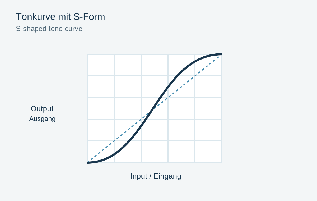
In the usual RGB display, the horizontal axis represents input: dark on the left, bright on the right. The vertical axis represents output: dark at the bottom, bright at the top. An unchanged diagonal maps each input to the same output. Raising a point in the middle brightens those midtones; lowering it darkens them.
The curve joins its points smoothly, so moving one point also influences neighbouring tones. Do not immediately add many anchors to prevent every surrounding change. That can create awkward bends which divide skin or skies into unnatural brightness zones.
Try a gentle S-curve
Place a point in the darker region slightly below the diagonal and a brighter one slightly above it. This gentle S-shape increases contrast between those regions. Leave the endpoints in place initially. A strong S can swallow shadows and reduce bright fabric texture even though the picture looks more forceful at first.
Compare two specific areas: a dark textured surface and a bright textured surface. Are both still understandable, and does the new contrast support the subject? In fog, the same curve may be unsuitable because it destroys the soft layering that gives the scene its character.
For a softer effect, try raising darker midtones and lowering brighter ones instead. This is different from lifting the black endpoint. The latter turns even the deepest black grey and creates another overall appearance.
Change colour channels only with a goal
A combined RGB curve changes the brightness relationships of all channels. Individual red, green or blue curves also change colour balance. Raising the blue curve in shadows can make them look cooler. If your only aim was increased contrast, an individual colour curve is usually the wrong starting point.
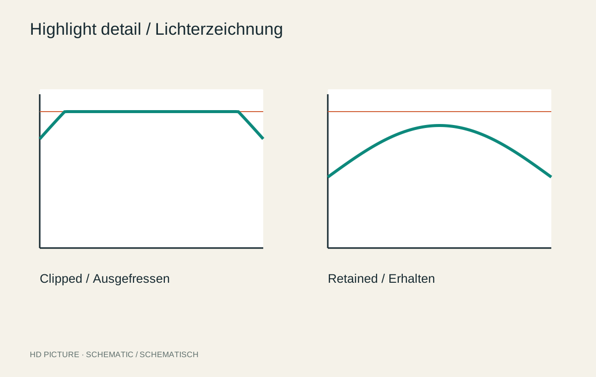
For deliberate colour styling, make small changes and watch neutral objects. An apparently minor bend can create colour bands in smooth gradients. After larger adjustments, also check channel clipping: one colour channel may reach its limit before the whole area appears white.
Test a curve against three surfaces
Take a photograph containing a dark coat, grey wall and white shirt. If only the wall seems too dark, place a middle point and raise it slightly. Watch how the coat and shirt respond. Another restrained point can stabilize a neighbouring region, but every extra point increases complexity.
Then compare a local wall adjustment with the global curve. If face and wall share similar tones, the curve changes both. It recognizes values rather than objects. A mask is more appropriate when only the wall should brighten. This distinction prevents trying to solve a spatial problem with increasingly numerous curve points.
Also preserve the ordering of tones. A strongly bent-back curve can render originally brighter values darker than their neighbours, creating a solarized appearance. That may be intentional as an effect, but is usually unwanted in a natural correction. When unexpected contours appear, a simpler curve is often a better repair than adding counteracting points.
Check the curve within the complete edit
Toggle the curve off and on. If the difference is merely “more effect”, reconsider your original aim. A useful curve adjustment need not look dramatic. A small change separating the subject from its surroundings may be enough.
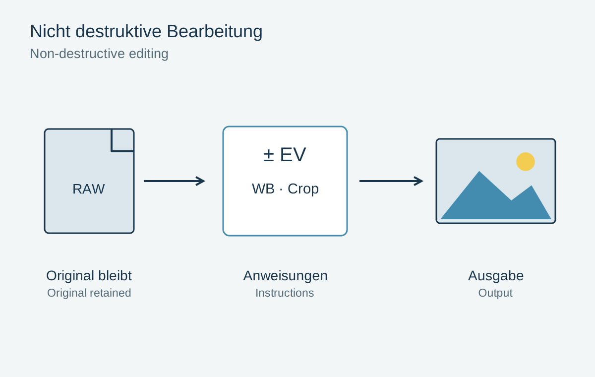
Later local adjustments and output settings can change the result further. Inspect the finished file at its intended size. Retain the curve as an editable setting so a different paper surface or new use does not require starting the entire edit again.