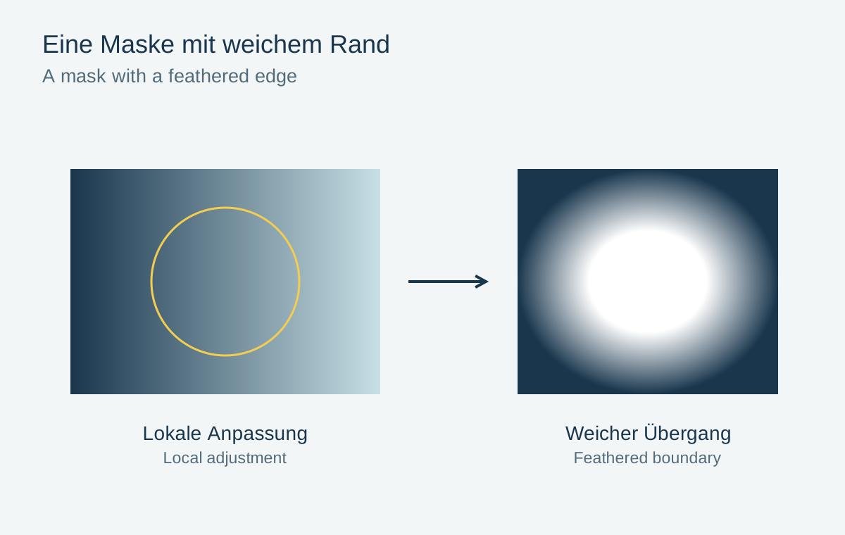
A mask can brighten a face, darken a sky or correct the colour of one surface. The selection alone does not determine quality. An accurately detected person can still look cut out when made much brighter than the surroundings. Both the mask transition and the strength of the adjustment matter.
Make the selection visible
Display the mask overlay and check which areas are actually selected. Automatic selections may misinterpret hair, translucent fabric or gaps between branches. Add or subtract those areas deliberately. Do not rely solely on a label such as “Subject” or “Sky”.
A soft brush creates a gradual edge. Lower flow lets you build an effect through repeated strokes. These settings serve different purposes: a broad soft transition is not the same as making the entire mask weaker. Compare their effects on a simple area before tackling a difficult contour.
Create lighting transitions rather than stickers
On a face, a broad restrained lift can look more natural than a very bright, precisely bounded selection. Include the neck and nearby clothing when they receive the same light. At the same time, avoid lifting the dark background into a glowing outline.
A gradient alone may not suit a sky with a building projecting into it, since the building would darken too. Combine the spatial selection with an appropriate range restriction where the editor supports it. Then inspect roof edges without the overlay. A thin bright fringe can be easy to miss in mask view.
A bright window behind a person
In an indoor portrait, the window should become slightly darker without changing the head in front of it. A rough rectangular mask also covers hair and shoulders, while automatic window selection may miss gaps between strands. Begin with the simplest suitable selection and inspect critical transitions at moderate magnification.
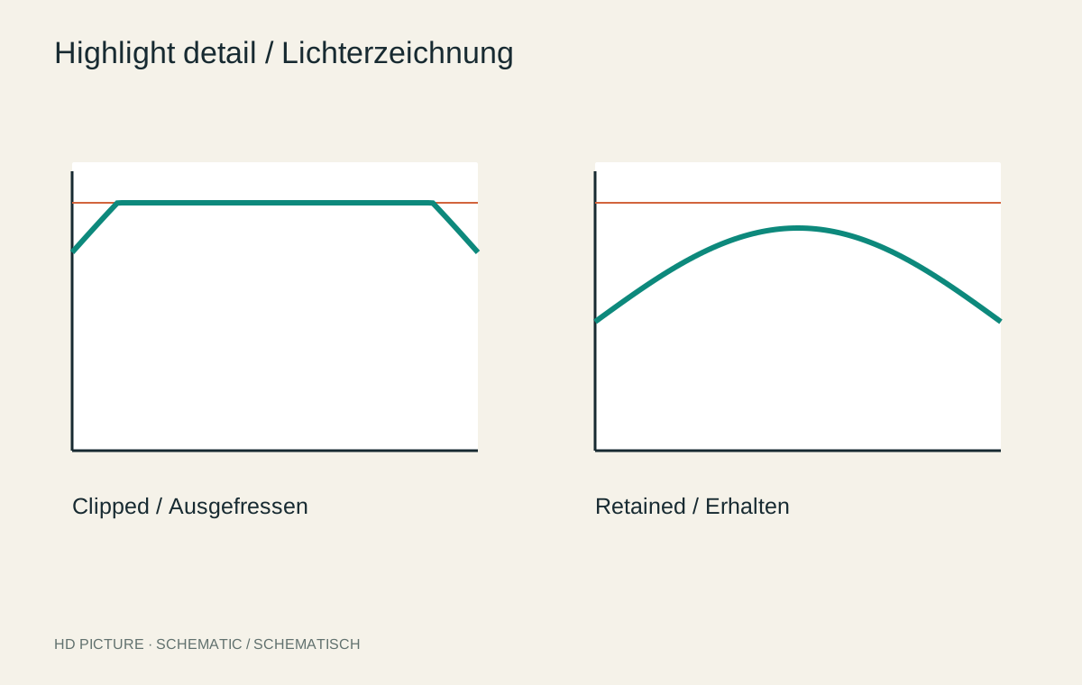
Reduce brightness only slightly at first. A heavily darkened window behind unchanged bright hair gaps immediately produces a glowing rim. Sometimes retaining part of the brightness difference works better than tracing every gap with an elaborate mask. The picture may still show that a bright light area existed behind the person.
Then inspect soft highlights along shoulders and cheeks. If the window becomes almost black while these reflections remain bright, the lighting loses coherence. A local correction should support the existing light pattern rather than bring every surface to the same brightness.
Keep window darkening and any face brightening in separate masks. This lets you judge their interaction and reduce one without redrawing the other. Name both clearly and check their placement again after a later crop.
Use two viewing scales
Magnification reveals ragged edges and small holes. The full view reveals whether the lighting remains plausible. Alternate between both. A pixel-clean selection can still form an unnatural bright island in the overall scene.
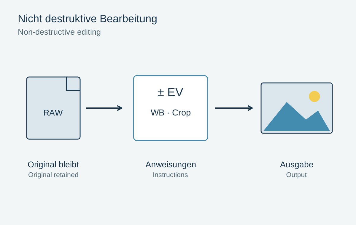
Briefly disable the adjustment. If the subject previously belonged more convincingly within the scene, reduce its strength. Name multiple masks by purpose, such as “Face slightly brighter” or “Window colour”, so later changes remain understandable. Preserve the original and editable masks rather than keeping only a flattened final file.