A light-emitting display and an illuminated paper print create their appearance differently. If the monitor is set very bright, you may darken a photograph too much while editing. The resulting print then appears dark even when the file has been reproduced as supplied. Reliable judgement therefore starts with reasonably consistent viewing conditions.
Recognize changing automatic settings
Disable warm night modes and deliberately vivid display settings when making colour decisions. Also check automatic brightness if it changes noticeably during editing. A photograph should not need adjustment simply because sunlight outside the window has changed.
Avoid direct reflections and strongly coloured surfaces immediately beside the display. Work under reasonably even lighting. A completely dark room can make the monitor seem extremely bright, while harsh sunlight on the screen makes shadows difficult to see.
Understand calibration and profiling
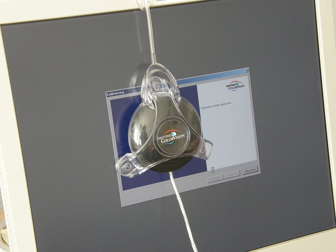
Calibration brings the display toward defined targets; a profile describes its colour behaviour to colour-managed applications. A measuring device makes this more reproducible than purely visual adjustment. It cannot, however, make a display show colours outside its physical capabilities.
Use a profile matching the actual state of the monitor. An arbitrary downloaded profile for a similar model may be wrong. Major changes to display settings can require another measurement. Even a correct profile helps only when the application uses colour management.
For a recurring print workflow, record the display setting and workplace lighting. That makes later differences easier to investigate. A fixed brightness percentage is not a universal measurement: two displays can emit very different brightness at the same percentage. What matters is their actual state under your working conditions.
Separate a display issue from a file issue
Suppose a photograph looks neutral in the editor but much more vivid in a browser. Do not immediately reduce saturation in the master. Check whether both applications open the same file, whether soft proofing is active and whether the export contains a suitable profile. Another file or view can explain an apparent display fault.
Next open a known reference file in both applications. If it shows the same difference, application behaviour or colour management becomes a more useful investigation than the individual photograph. If only the new export differs, check profile assignment and conversion. Keep these tests small and change one condition at a time.
Compare a second device only afterwards. A phone may use automatic brightness, vivid colour or a warmer evening mode. The same image need not look identical there even when the export is technically appropriate. Aim for a clean, understandable workflow on your working display and compatible delivery, not complete equality across every other screen.
Compare with a known print
View a suitable reference print under neutral, adequate light beside the corresponding file. Do not expect every material property to match: paper white, surface gloss and emitted brightness differ. The comparison mainly helps reveal large brightness or colour discrepancies.
If only one file looks different, investigate its profile and export first. If nearly every print appears similarly dark, the display or viewing environment is a useful place to investigate. Do not randomly alter each photograph before identifying the shared cause.