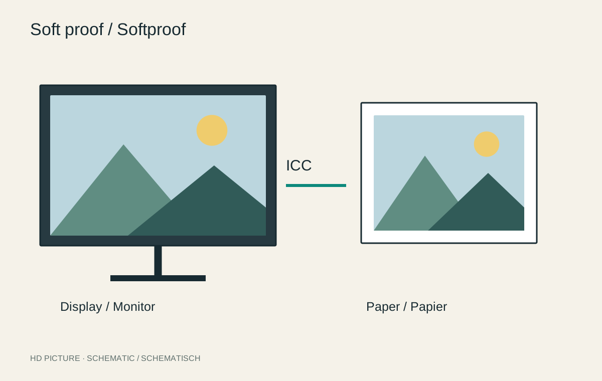
Soft proofing displays an approximation of a particular printed output. It can reveal colours that the chosen paper and printing process cannot reproduce. The preview is not a view of an already existing print, however. It depends on the profile, settings, monitor and viewing conditions.
Obtain the correct output profile
Use the profile for the specific printing process and paper, or the explicitly described laboratory product. A glossy-paper profile is not automatically suitable for a matte variant. Read the provider’s instructions: some profiles are intended only for previewing and should not be used to convert the delivered file.
Enable proofing in a colour-managed application and select that profile. Check whether paper white and black reproduction should be simulated. These options may initially make the preview look flat because they represent the paper’s more limited contrast.
If the provider offers several similarly named profiles, check the product, surface and intended purpose. An outdated profile for a discontinued material can give a convincing but incorrect preview. Keep the associated instructions with the project so the basis of the print version remains understandable later.
Treat warnings as guidance
A gamut warning marks problematic colours, but does not alone show how distracting their mapping will be. Inspect the subject without the warning overlay. Relevant details include tonal differences in a red flower or texture in a dark jacket. A small colour patch that cannot be reproduced exactly may be unimportant.
Compare rendering intents where the workflow permits. Their effects depend on the profile and picture. Do not assume that one setting treats every subject better. Judge the visible relationships between neighbouring colours and tones.
Create a separate print version
If adjustments are necessary, create a version for that paper. Gently lift important dark detail or reduce a problematic saturation locally, for example. Do not accidentally change the general master needed for another output later.
Name the version for its paper or product and check the export against the laboratory instructions. An enabled soft proof changes the view, but does not automatically mean the file has been converted appropriately. Previewing and delivering a file are separate steps.
A red flower as a test case
Imagine a photograph with vivid red petals and dark green foliage. Fine differences in the red are visible in the normal screen view. In the soft proof, several petals merge into a uniform area. Increasing global saturation would probably make this worse. Instead, test whether a small local saturation reduction or slight separation of brightness values makes the petal shapes readable again.
Create a print version and change only the affected flowers. Compare it with the unchanged version while simulation is enabled. The aim is not to remove every gamut warning, but to preserve important structure intelligibly on the chosen paper. Green leaves and a neutral background should not accidentally change character through this adjustment.
Choose a proof section containing the flower, dark foliage and a neutral area together. An isolated red patch says less about the complete impression. Record the profile and correction so another proof can be produced under comparable conditions.
Finish with real paper
For an important large print, order a small test or a section at final scale first. View it under the intended lighting. Gloss, surface texture and reflections are only partly predictable on a screen.
If proof and preview differ substantially, first check the profile, automatic laboratory corrections, monitor brightness and viewing light. Avoid changing several things simultaneously. One documented adjustment followed by comparison is more useful than a sequence of unplanned compensations.